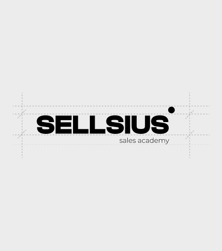
Sellsius Branding
Sellsius is a sales academy built for a new generation of sales professionals — people who don’t rely on random scripts, intuition, or pressure, but on structure, performance, and clear measurable growth.
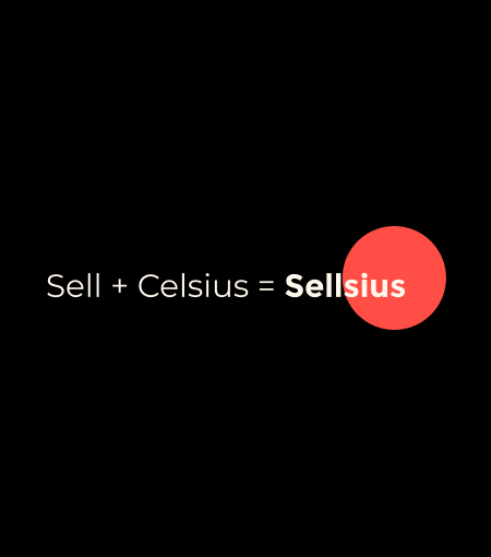
The name combines two core ideas: Sell and Celsius.
Sell reflects action, revenue, and growth.
Celsius brings the idea of measurement, precision, levels, and control.
Together, Sellsius becomes more than a name. It represents a sales system where every step can be measured, improved, and scaled.
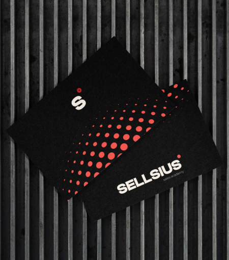
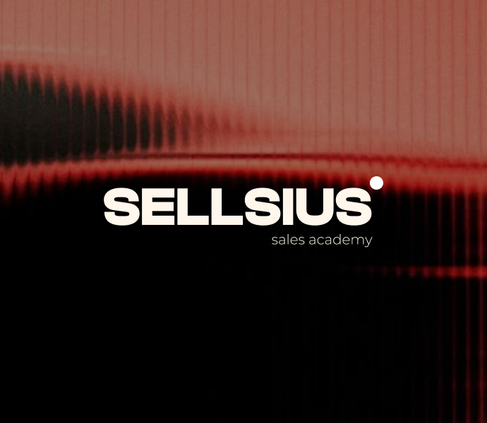
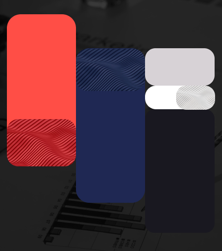
The brand identity was created to communicate this same idea visually: sales as a process, not a guess. Bold red energy, deep blue structure, and minimal graphic forms build a visual language that feels sharp, confident, and performance-driven.
What we did
We developed a complete brand identity system for Sellsius — from naming logic and positioning to visual language and application.
The goal was to create a brand that feels modern, structured, and powerful, while clearly reflecting the academy’s core promise: teaching sales through clarity, control, and measurable progress.
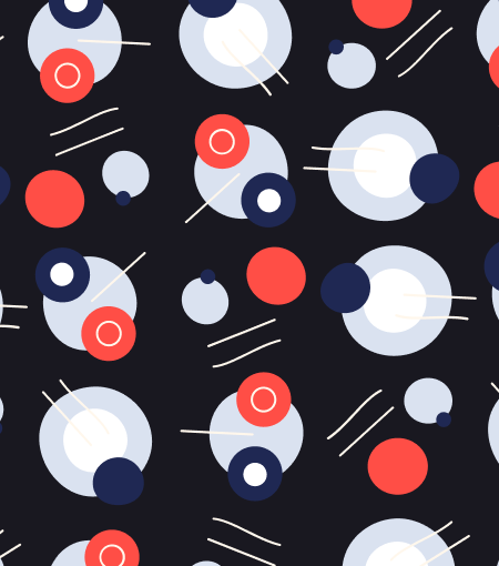
We created a visual system based on movement, touchpoints, and structured interaction. The pattern represents the sales journey: each element reflects a stage, a contact point, or a step that moves the customer closer to conversion.
The color palette was designed to balance energy and authority:
Red for pressure, movement, and performance.
Blue for trust, structure, and control.
Minimal forms for clarity in execution.
Our Solutions
- Brand Identity Design
- Logo Design
- Visual Storytelling
- Brand Style Guide Creation
- Illustration and Iconography
And here is the result
The result is a bold and recognizable identity that positions Sellsius as more than a sales academy — it becomes a system for growth.
The brand now communicates exactly what it stands for: sales that are not random, not intuitive, and not based on guesswork, but measured, optimized, and scalable.
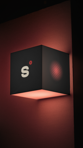
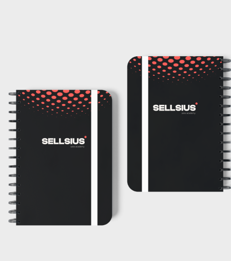
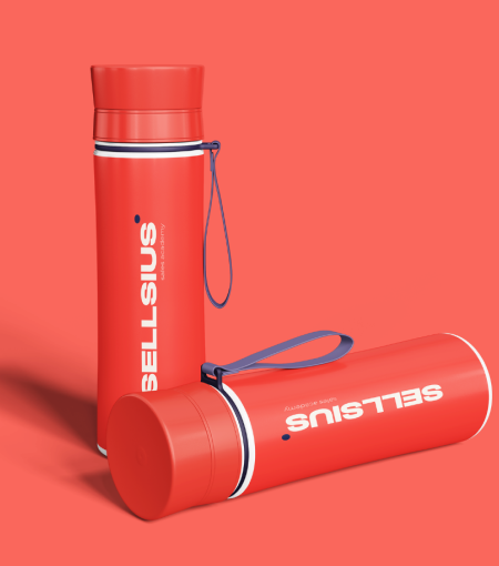
From digital platforms to presentations, event visuals, and learning materials, the identity creates a strong and consistent presence. It gives Sellsius a clear visual voice: confident, structured, and built for performance.
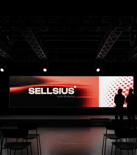

Brand in Action
Bringing Sellsius to life meant translating the logic of sales into a visual system.
We explored how a sales process moves: from first contact to trust, from interaction to decision, from scattered actions to structured conversion. This became the foundation of the brand’s pattern, rhythm, and graphic language.
Every dot, form, and movement in the identity was designed to feel intentional — like a step in a process. The backstage work was not only about creating a strong visual look, but about building a system that reflects the way Sellsius teaches sales: with structure, precision, and control.