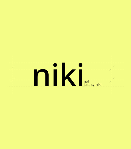
Niki Syrniki Branding
Niki is a syrniki brand built around the warmth of homemade mornings — soft, cozy, and full of care.
The brand was created to capture that familiar feeling of fresh syrniki in the morning: simple ingredients, handmade softness, and the comfort of something prepared with love.
For Niki, branding was not only about creating a beautiful identity. It was about turning a morning ritual into a visual language — warm, modern, natural, and deliciously human.
What we did
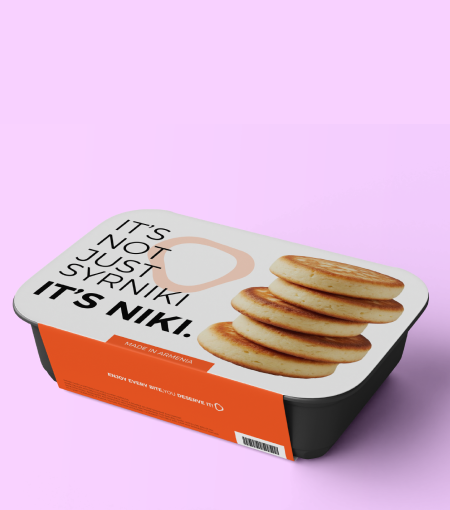
We developed a complete brand identity for NIKI, including logo concept, color palette, packaging design, brand elements, pattern system, and social media visual direction.
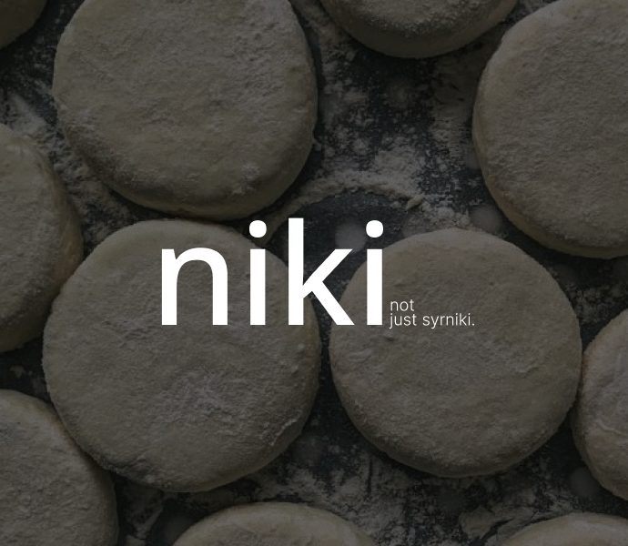
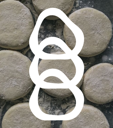
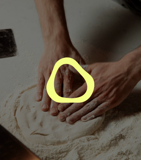
The logo was inspired by the organic handmade form of syrniki dough — soft, imperfect, and real. We wanted it to feel shaped by hand, not machine, reflecting the brand’s authenticity and homemade character.
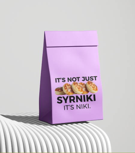
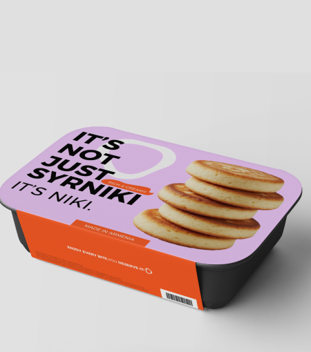
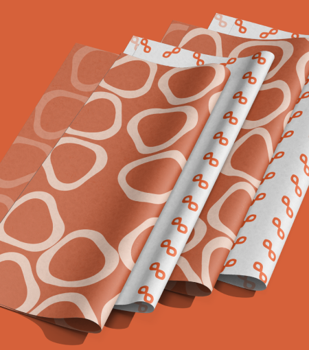
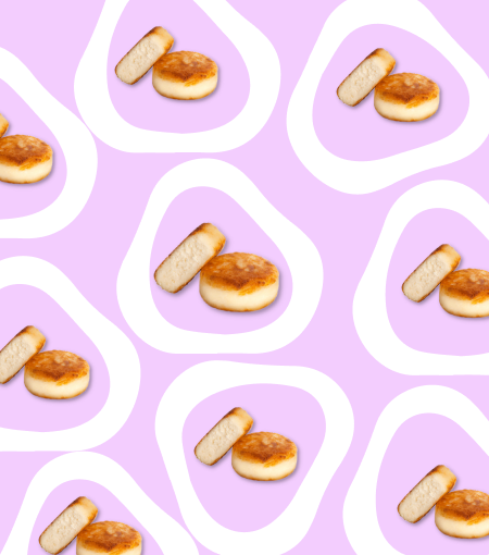
The color palette became an important part of the identity: warm orange for appetite and comfort, soft purple for balance and creativity, light yellow for morning light, white for purity, and black for contrast and elegance.
We also created graphic elements inspired by the circular motion of dough, bringing softness and movement into the packaging and digital communication.
Our Solutions
- Brand Identity Design
- Logo Design
- Visual Storytelling
- Brand Style Guide Creation
- Packaging Design
- Illustration and Iconography
And here is the result
The result is a fresh, warm, and memorable identity that makes Niki feel instantly human.
The brand now has its own visual world — from packaging to social media — built around the feeling of a sunny morning kitchen. Every detail communicates freshness, simplicity, and care before the first bite.
Niki’s identity feels modern without losing its homemade soul: soft, appetizing, honest, and full of warmth.
Brand in Action
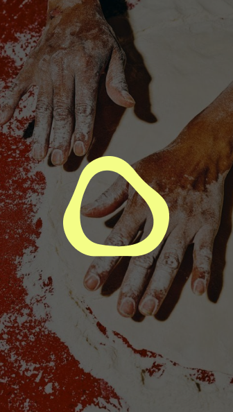
Bringing Niki to life started with a feeling: the smell of homemade syrniki in the morning.
We explored how to translate that emotion into design — through soft shapes, warm colors, airy layouts, and packaging that feels clean but cozy.
The process was about finding the right balance between homemade and modern. Every element had to feel simple, natural, and crafted with care, while still giving the brand a clear and professional visual presence.
The final identity became a warm visual story about morning light, handmade food, and the beauty of simple everyday moments.