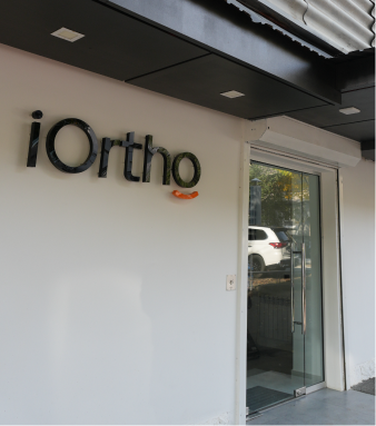
Building the Visual Identity for iOrtho.am
A visual identity is not decoration.
It’s a system.
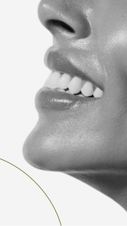
For iOrtho.am, a modern dental clinic, the challenge was to visually communicate what matters most in orthodontics: precision, trust, and care — without falling into generic medical aesthetics.
This project marked a new chapter for a brand rethinking how professionalism is seen and felt.
What we did
Before designing anything, we started with strategy.
-
Defined brand goals and long-term positioning
-
Analyzed audience behavior and expectations in the healthcare space
-
Refined tone of voice and visual direction
-
Reviewed international orthodontic and dental brands to understand category patterns
Once the foundation was clear, we moved into execution.
-
Developed a clean, confident color palette
-
Built a typography system and grid structure based on precision and clarity
-
Designed a visual language that feels clinical, modern, and human
-
Applied the system across digital and on-site touchpoints
Every choice served a function. Nothing was visual noise.
Our Solutions
- Social Media Marketing
- Targeted Advertising
- Content Creation
- Digital Marketing Campaigns
- Video Production
- Professional Photography
- Content Marketing
- Visual Storytelling
And here is the result
The outcome was a cohesive visual identity designed for consistency and scale.
-
A clear, recognizable brand system across all platforms
-
Strong differentiation within the local dental market
-
A premium digital presence that supports trust and professionalism
The identity didn’t just look modern — it worked strategically.
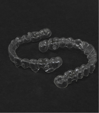
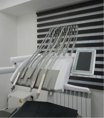
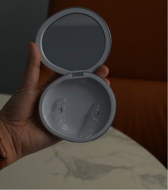
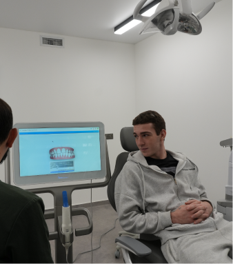
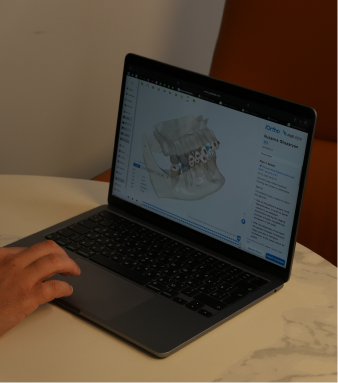
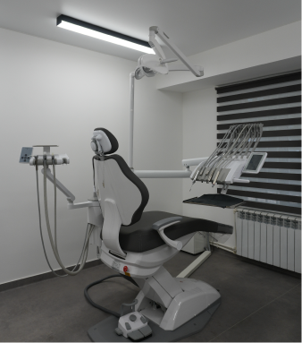

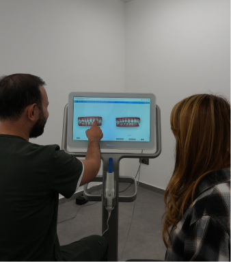
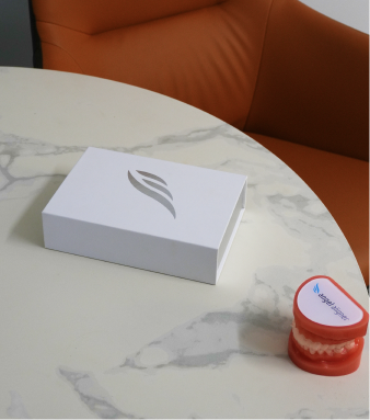
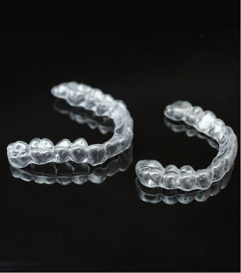
Brand in Action
iOrtho’s visual identity was developed through structured category research and competitor analysis within the healthcare space.
The design system was implemented across digital channels using a performance-driven approach. Visuals were tested, optimized, and scaled based on user interaction and platform behavior.
Every visual element was designed to reinforce trust, clarity, and professionalism — from layout hierarchy to material presentation. The result is a disciplined design system that communicates precision and credibility across all touchpoints.
Function-driven visuals. Built to support trust.