Insurance Branding
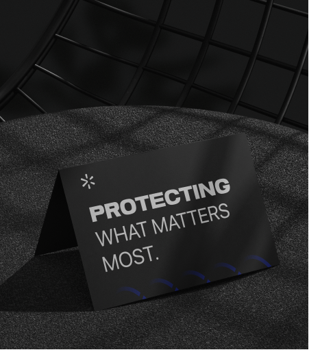
Branding That Protects What Matters Most.
For SafeNest, we crafted a brand identity that blends security with warmth.
The name itself communicates the promise: “Safe” for protection and trust, “Nest” for home, family, and care.
From the tone of voice to the visual identity, every element of SafeNest was designed to reflect this balance.
What we did
Naming & Concept:
Simple, memorable, and emotionally resonant — positioning the brand as a protector of both assets and loved ones.
Brand Strategy & Positioning:
“Protecting your nest, securing your future.” A family-focused narrative that builds trust and reassurance.
Tone & Feel:
More than insurance — a partner in safety and peace of mind.
Visual Direction:
Soft yet strong, designed to convey reliability without losing the sense of comfort and nurture.
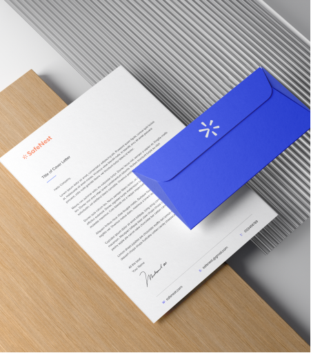
Our Solutions
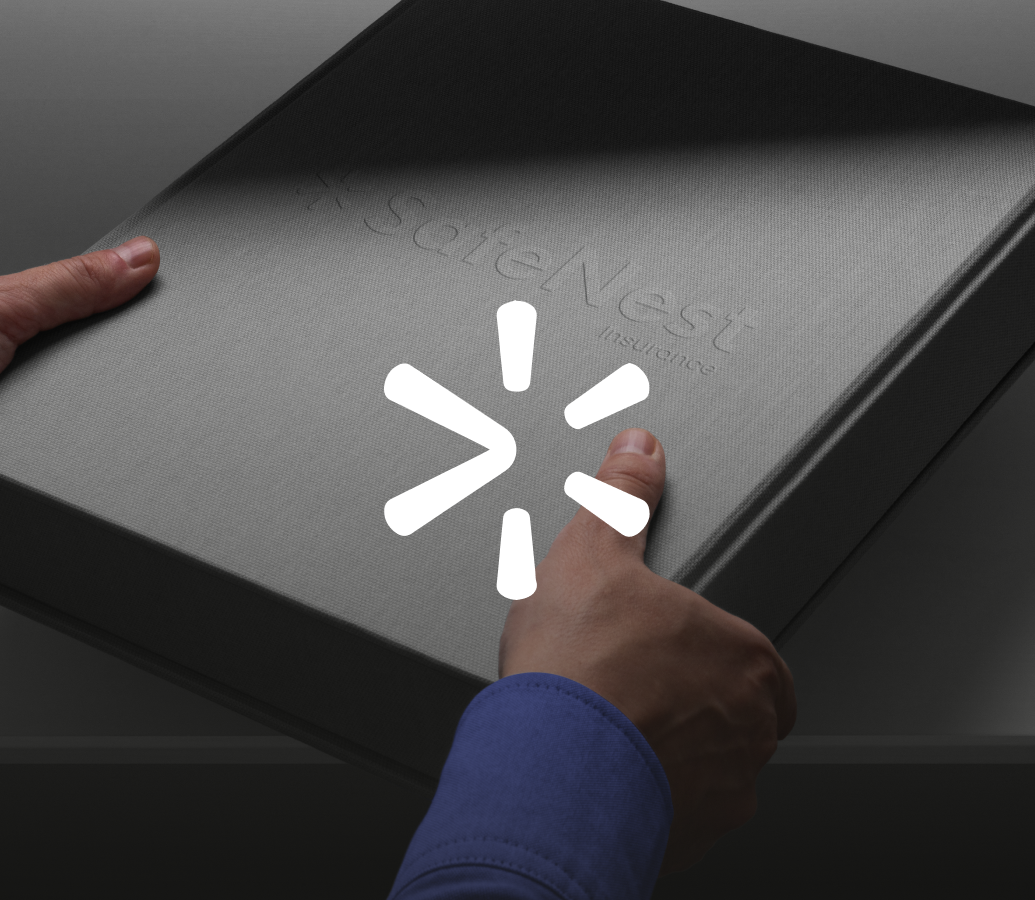
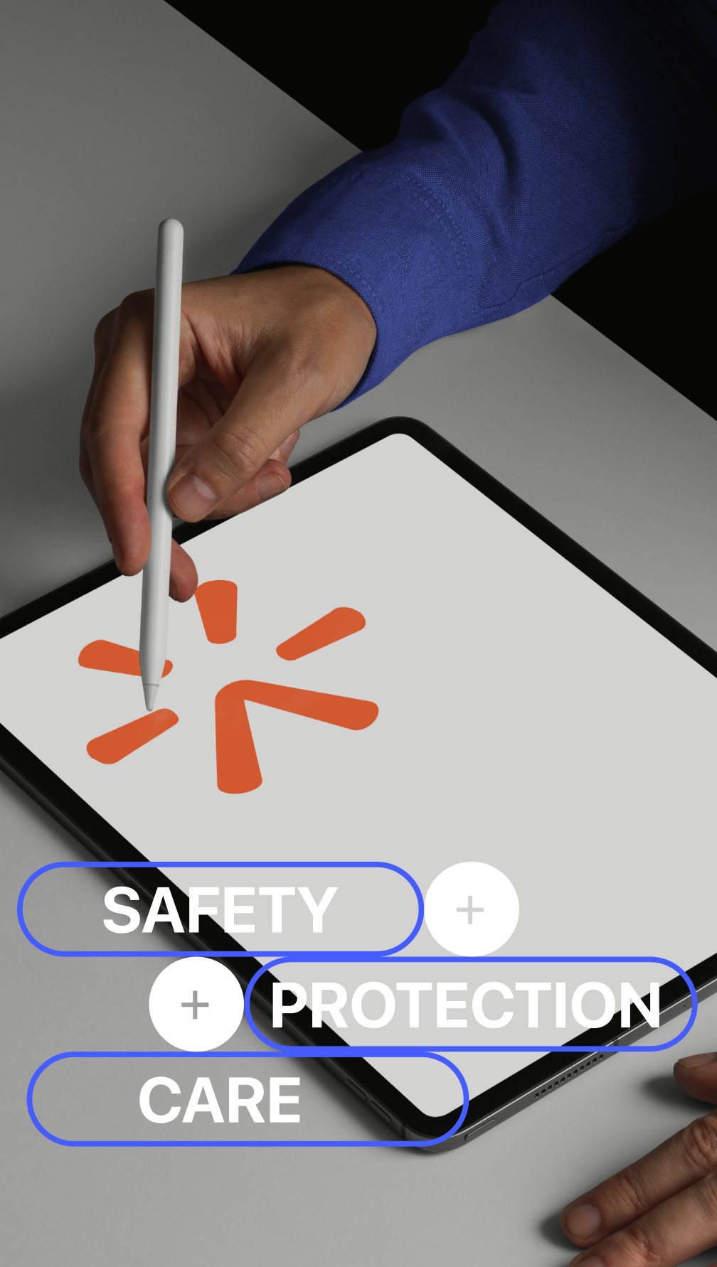
- Brand Identity Design
- Logo Design
- Visual Storytelling
- Brand Style Guide Creation
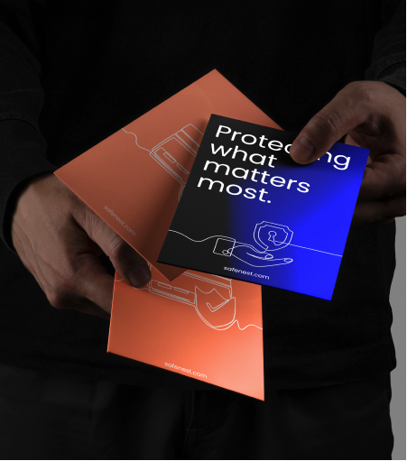
- Packaging Design
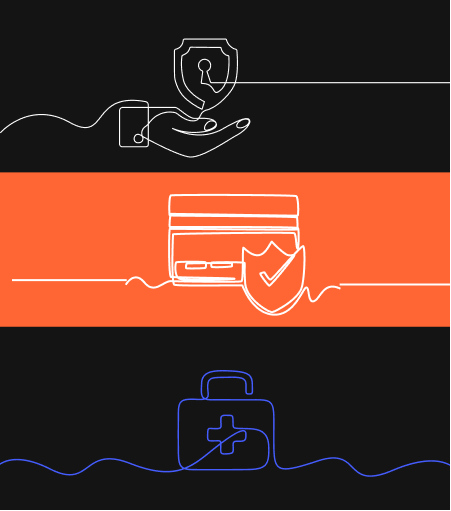
- Illustration and Iconography
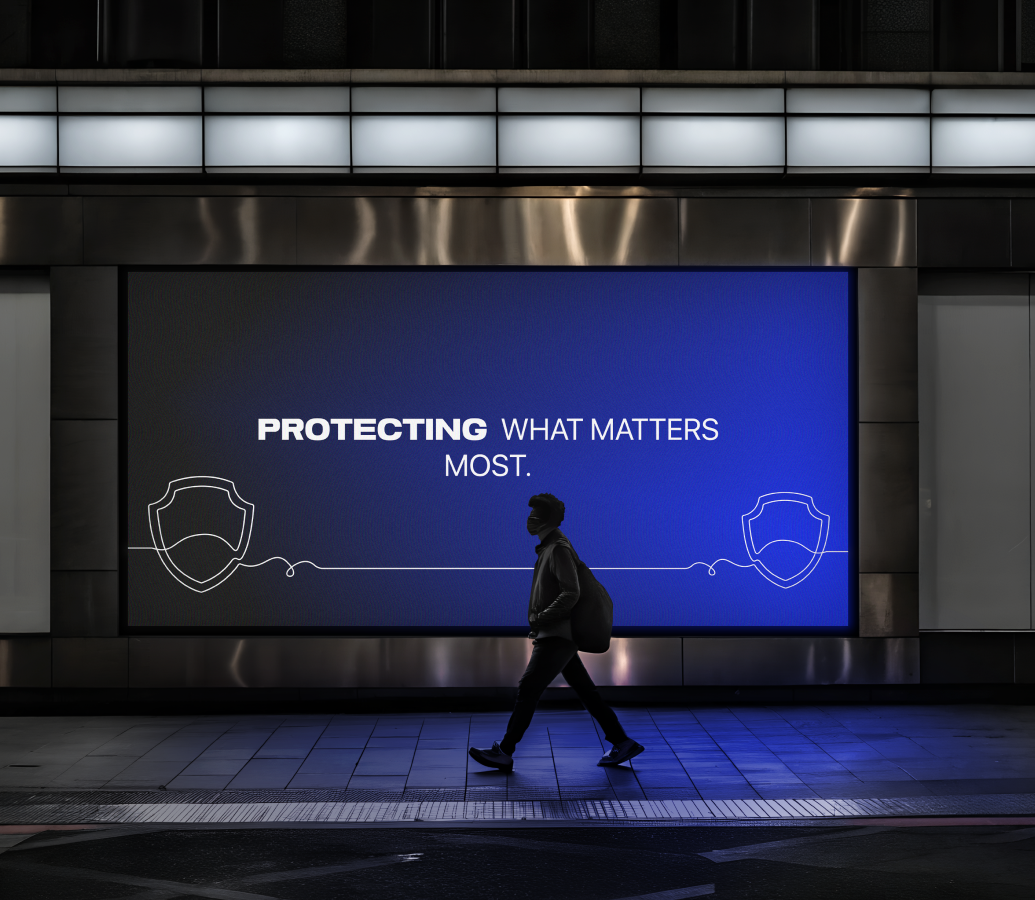
And here is the result
SafeNest’s identity finds the perfect harmony between protection and comfort. It connects with homeowners, families, and individuals not through fear, but through trust.
The result is a brand that feels personal — one that replaces corporate detachment with empathy. SafeNest doesn’t just promise safety; it makes people feel safe. Every touchpoint — from the logo to the tone of voice — reinforces a single message: you and your home are protected here.


Brand in Action
The SafeNest project began with a single insight — security should feel human.
Our creative process focused on empathy as much as design. We explored what “home” means to people: not just walls and roofs, but feelings of belonging and safety.
Behind every design decision was one guiding question: does this feel safe?
Because in a world full of noise and uncertainty, SafeNest had to become more than a brand — it had to become a sanctuary.