HUSH Hotel & Spa
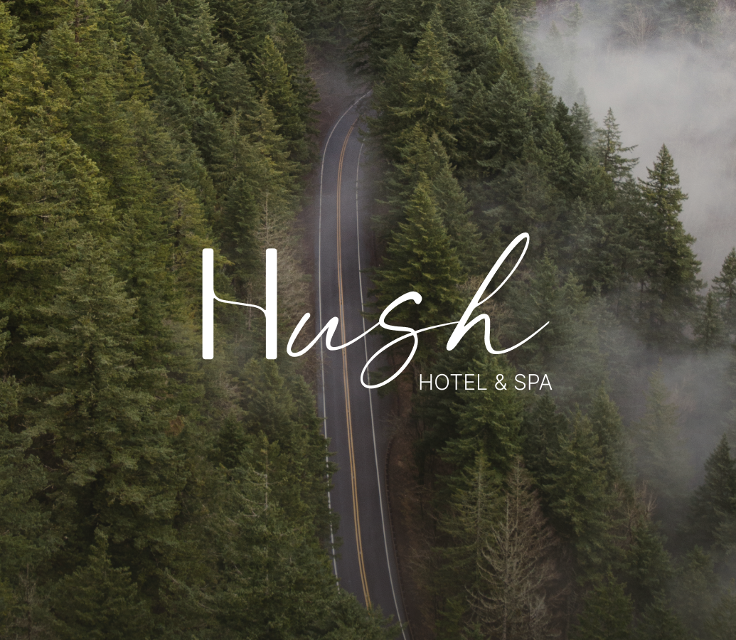
HUSH Hotel & Spa is a retreat in the quiet rhythms of Dilijan — designed for guests seeking stillness, softness, and the gentle escape of silence. The brand needed to embody this feeling: calm, present, and effortlessly elegant. Drawing inspiration from the forest, the winding road into town, and the unique architecture of the region, we built an identity that holds space rather than fills it — a visual language that breathes, curves, and dissolves into its surroundings.
What we did
We developed a complete brand identity rooted in place, motion, and quiet:
-
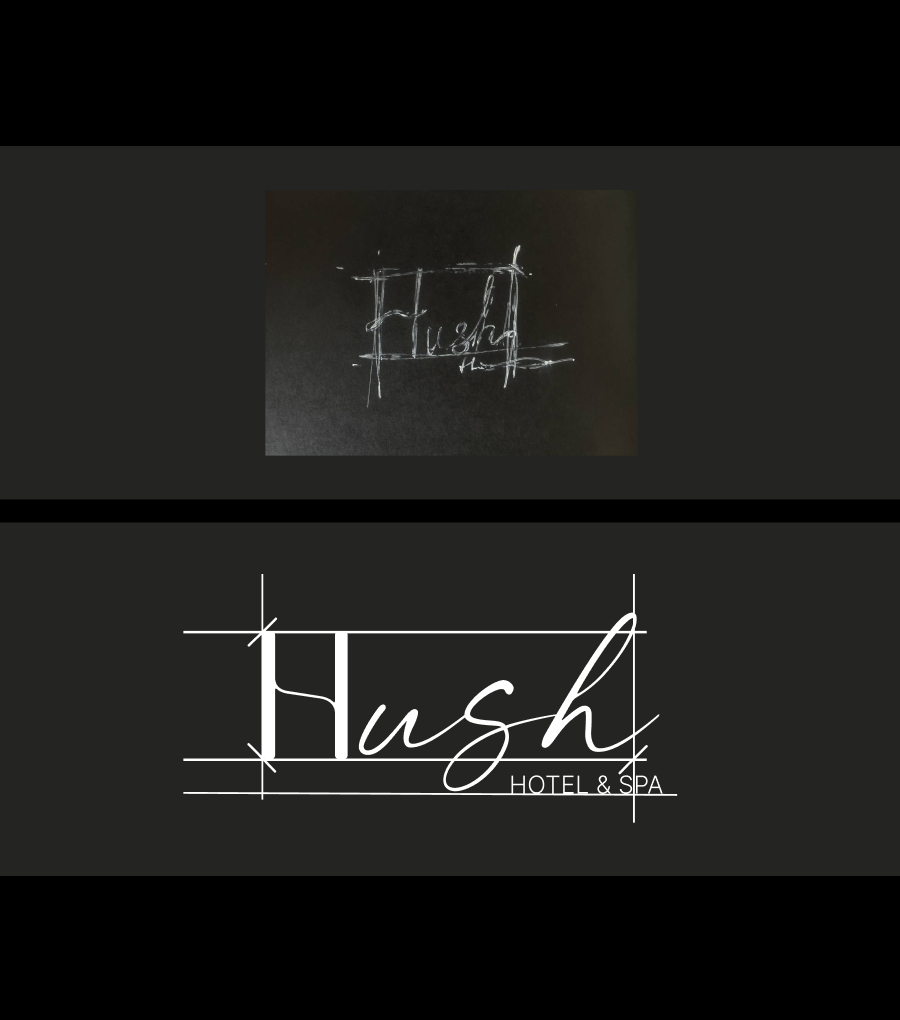
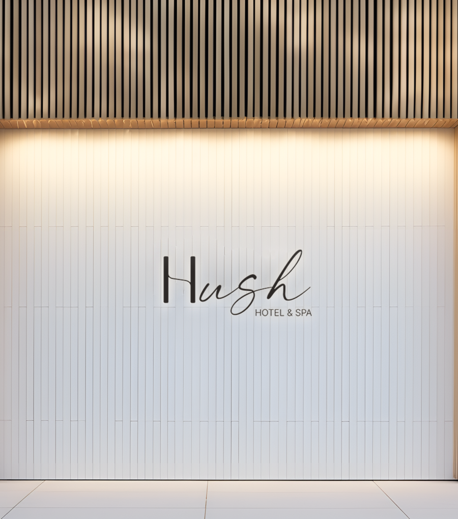
Naming — short, resonant, and breathing meaning: HUSH.
-
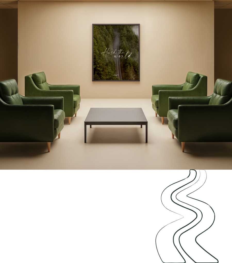
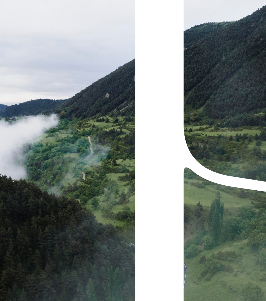
Logo & Custom Lettering — hand-drawn to balance flow with form, inspired by the tunnel and seven curves leading into Dilijan.
-
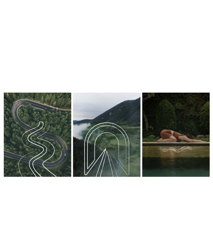
Visual System — graphic shapes echoing calm, passage, and natural motion.
-
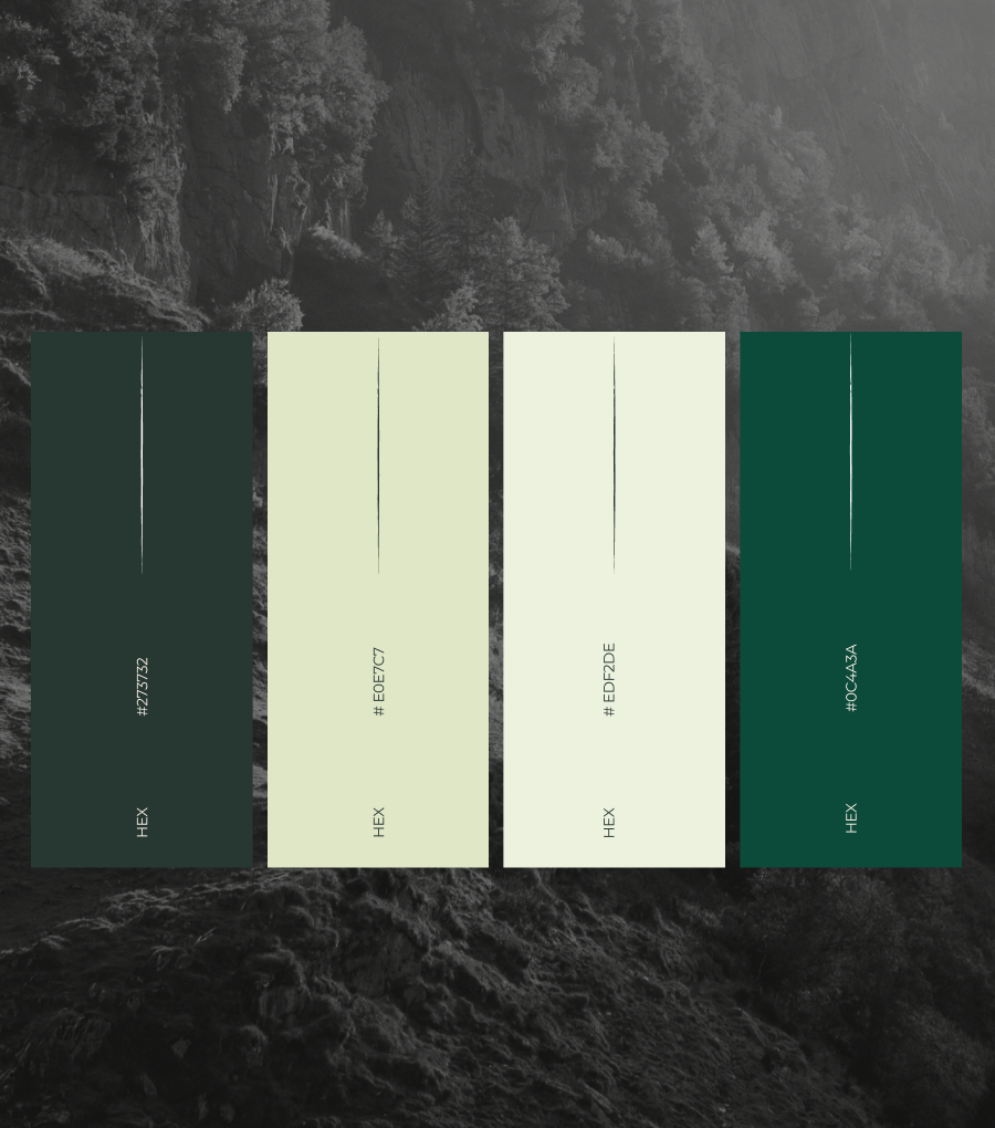
Color Palette — deep greens, muted earth tones, and light neutrals that merge seamlessly with the forest setting.
-
Typography System — spacious, soft, and balanced for both print and digital use.
-
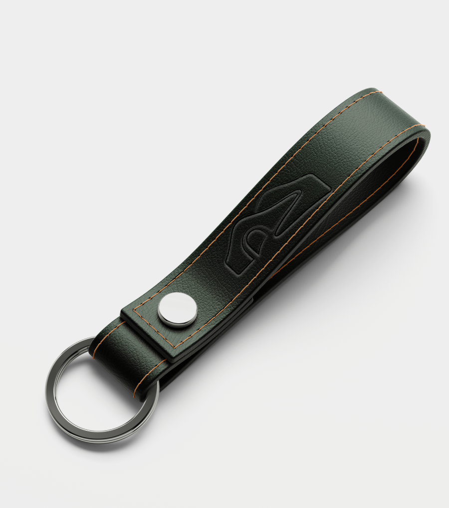
Applications — from spa menus to key cards, signage, and marketing materials.
Our Solutions
- Brand Identity Design
- Logo Design
- Visual Storytelling
- Brand Style Guide Creation
- Packaging Design
- Illustration and Iconography
And here is the result
The final identity feels as quiet and grounded as the hotel itself. It avoids visual noise, instead embracing soft curves, open space, and colors that dissolve into the surroundings. The seven-turn motif ties the brand unmistakably to its location, creating a sense of arrival and belonging. Guests encounter the brand as an experience — one that moves in curves, breathes in green, and lets silence take the lead.

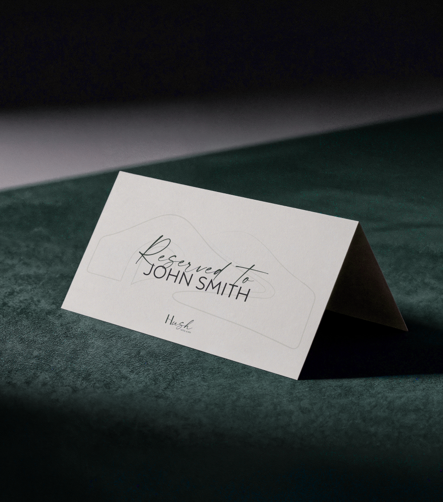
Brand in Action
HUSH’s visual system comes to life across every touchpoint:
-
Signage that guides visitors with soft curves and minimal text.
-
Spa menus & room materials that hold generous whitespace, inviting pause.
-
Key cards & stationery in forest tones, subtly embossed with the logo.
-
Digital presence that mirrors the physical brand — slow scrolling, uncluttered layouts, and nature-driven imagery.
The brand isn’t just seen; it’s felt — a consistent, calm presence from the first website visit to the final turn down the forest road.